Iris Sweatshirt
Project Description
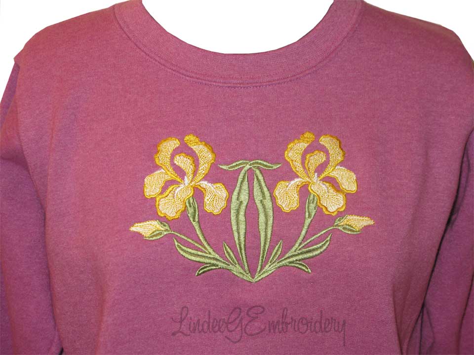
In month eight of the Echidna PIE Embroidery Training Series, we take a deep dive into color. I’m often asked how I choose colors for a design and there are a lot of factors that affect my choice.
Oh sure, designs come with recommended colors. My original iris designs in this collection were blue-purples. How do you think they’d look on this red-purple sweatshirt?
Since we’re using the fill stitch version this month which is designed more realistically than the applique or redwork versions, choosing the wrong colors can totally ruin the appeal of the finished project.
Our project also involves some simple customizing. Once again, I’m working in software and with a project this basic, you could get a similar result at your sewing machine.
When overlapping designs, you’ll need to think about extra layers of stitching, how it will affect your project, and what can be done about it. Thread is not ink! Overlapping designs can be a huge problem.
We’re stitching on a purchased sweatshirt. Fleece requires some different considerations from the stable wovens we’ve worked with up to this point so obviously we’ll need to address that as well. For example, fleece is thick and spongy, not to mention stretchy. How do you counteract that?
February again has two flowers. In fact, seven months have two flowers. If you’re making the quilt, you can choose either flower. Maybe you prefer the shape, color, or meaning of one flower over the other. For my quilts, I used all the Australian flowers for the black quilt and all the U.S. flowers for the white one.
The main meaning of the primrose is love and happiness while the iris represents faith, wisdom, peace of mind, friendship and hope.
Credits
Designed and made by: Lindee Goodall (2/15/2015)
Products Used


All Designs